NAMHS has launched a full-scale rebrand. The executive team initiated the rebrand to provide a refreshing new look to reflect the new life within our growing and evolving company.
Haylee Ward, NAMHS Communication & Design Specialist, created the logos to better communicate what we do, who we are, and what our mission is in this new stage of the organization.

Logo Exposition
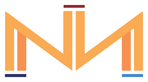
The North American Mental Health Services “mark” refers to the NA focal point in each of the three logos and is composed of three parallel, double line pillars. To unify the three NAMHS divisions, our new logos connect through one harmonious symbol. Each pillar represents a company: North American Mental Health Services, Native American Mental Health Services, and Homepsych.
The NA is a reflective shape to show the goal of reflective care in all our clinics and with each patient: the competent care our providers deliver is based on the specific needs of our patients. Layered into the “mark,” two inner lines of the outer pillars are a slightly different shade of orange. This intentional design is symbolic of our two main service offerings— therapy and medication management — that are the pillar of our practice.
The composition of the complete logo was done with specific intention to highlight our mission. The primary logo places the “mark” on top of “Mental Health Services” underscoring mental health services as our company’s foundation. NAMHS was created to support the need for mental health services within the underserved communities we reach.

The primary logo also places “North American” centered on top of the “mark,” with the center of the mark pointing up towards “North American” to direct our patients to the solution for mental health needs: NAMHS.
The NA “mark” is repeated within the logo of each of the three companies we operate services through (North American, Native American and HomePsych) to create a cohesive look across the board and highlight their relationship. The Main differentiating factor lies in what we refer to as the finishing embellishments that complete each of the logos. The finishing embellishments along with a specific primary color inclusion are unique differentiators.
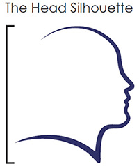
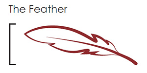
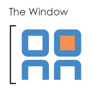
The embellishments—the head silhouette, the feather, and the window— depict the key service element of each respective company’s work.

North American: The Head Silhouette
Featuring an upturned silhouette, the North American Mental Health Services logo depicts a patient, looking forward and slightly up towards the future. As our mission states: At NAMHS, we are “changing lives to change the future.”
Native American: The Feather

The Native American Mental Health Services logo is symbolic of the native communities that we serve. Our Native American Mental Health Services mission is to provide mental health care that leads to health and wellness for the individual, home, community and nations. The feather itself is embedded with powerful symbolism, and here the angle is intended to mimic forward movement on one’s healing journey.
HomePsych: The Window

The window in the Homepsych logo has a dual stylistic role. First, it plays a part in making the logo’s big “A” a house from where a patient can receive care. The window also creates an abstract depiction of 2 people conversing: a patient and a virtual provider on a computer screen.
The Future of NAMHS
We believe this new look embodies NAMHS’ growth and evolution. We are looking forward to what the future holds for our company and for the patients we serve.
About NAMHS
North American Mental Health Services provides in-office therapy and medication management from offices in Redding, Eureka, Fairfield, Woodland, Monterey and Salinas. Native American Mental Health Services provides mental health services to native communities throughout California. HomePsych provides therapy and medication management entirely online to an expanding patient-base across California.


